A Comprehensive Guide to Using HTML and CSS for Your Website
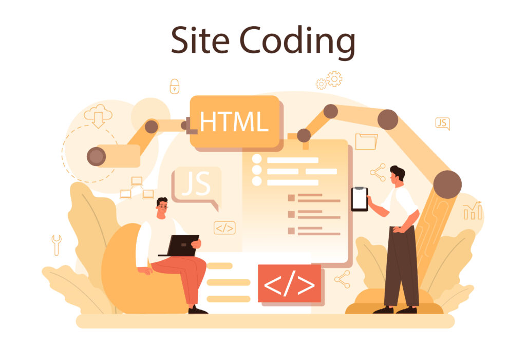
HTML (HyperText Markup Language) and CSS (Cascading Style Sheets) are the foundational technologies for building websites. While HTML provides the structure and content of your web pages, CSS is what brings them to life with styling and layout. Understanding how these two technologies work together is essential for anyone looking to create visually appealing and functional websites.
In this blog post, we’ll explore the relationship between HTML and CSS, how to use them effectively, and some best practices for building a professional website.
Understanding HTML and CSS
Before diving into the details, it’s important to understand the role of HTML and CSS in web development.
- HTML: HTML is the backbone of any website. It defines the structure of web pages using elements like headings, paragraphs, lists, links, and images. HTML is essentially the “skeleton” of your website, organizing content in a way that browsers can display.
- CSS: CSS is the design language that makes your website look good. It controls the visual presentation of HTML elements, including colors, fonts, spacing, and layout. CSS can transform a plain HTML document into an attractive, responsive, and interactive website.
The Basics of HTML
HTML uses a system of tags to define different types of content. Here are some of the most common HTML tags:
- Headings: HTML uses six levels of headings, from
<h1>to<h6>, with<h1>being the highest (or most important) level.
<h1>This is an H1 heading</h1>
<h2>This is an H2 heading</h2>
Paragraphs: The <p> tag is used to define paragraphs of text.
<p>This is a paragraph of text.</p>Links: The <a> tag creates hyperlinks to other pages or website.
<a href="https://www.example.com">Visit Example.com</a>Images: The <img> tag is used to embed images into your page.
<img src="image.jpg" alt="A description of the image">Lists: HTML supports both ordered (<ol>) and unordered (<ul>) lists.
<ul>
  <li>Item 1</li>
  <li>Item 2</li>
</ul>
The Basics of CSS
CSS uses selectors to target HTML elements and apply styles to them. Here’s a quick look at how CSS works:
- Selectors: Selectors are used to “select” the HTML element(s) you want to style.
/* Selects all <p> elements */
p {
  color: blue;
  font-size: 16px;
}
Properties and Values: CSS uses properties (like color, font-size, and margin) and values (like blue, 16px, and 10px) to define the styles for elements.
/* Applies multiple styles to <p> elements */
p {
  color: blue;
  font-size: 16px;
  margin: 10px 0;
}
Classes and IDs: Classes (.) and IDs (#) allow you to apply styles to specific elements.
/* Selects an element with the class "highlight" */
.highlight {
  background-color: yellow;
}

/* Selects an element with the ID "header" */
#header {
  font-size: 24px;
}
Linking CSS to HTML
There are three main ways to apply CSS to HTML: inline, internal, and external.
1. Inline CSS
Inline CSS is used to apply styles directly within an HTML element. It’s useful for quick, one-time styles but isn’t recommended for larger projects due to its lack of scalability.
<p style="color: blue; font-size: 16px;">This text is styled with inline CSS.</p>2. Internal CSS
Internal CSS is placed within a <style> tag in the <head> section of your HTML document. This method is useful for single-page websites or when you want to apply styles that are specific to that page.
<!DOCTYPE html>
<html lang="en">
<head>
  <meta charset="UTF-8">
  <meta name="viewport" content="width=device-width, initial-scale=1.0">
  <title>My Website</title>
  <style>
    body {
      background-color: #f0f0f0;
      color: #333;
    }
    h1 {
      color: #4CAF50;
    }
  </style>
</head>
<body>
  <h1>Welcome to My Website</h1>
  <p>This is a paragraph.</p>
</body>
</html>
3. External CSS
External CSS is the most efficient way to style multiple pages on a website. It involves creating a separate CSS file and linking it to your HTML document using the <link> tag. This method promotes reusability and keeps your HTML clean.
Example:
Create an external CSS file (e.g., styles.css):
body {
  background-color: #f0f0f0;
  color: #333;
}

h1 {
  color: #4CAF50;
}
Link the CSS file to your HTML document:
<!DOCTYPE html>
<html lang="en">
<head>
  <meta charset="UTF-8">
  <meta name="viewport" content="width=device-width, initial-scale=1.0">
  <title>My Website</title>
  <link rel="stylesheet" href="styles.css">
</head>
<body>
  <h1>Welcome to My Website</h1>
  <p>This is a paragraph.</p>
</body>
</html>
CSS Layout Techniques
CSS provides various layout techniques to control the positioning and flow of elements on your web page. Understanding these techniques is crucial for creating responsive, user-friendly designs.
1. The Box Model
The box model is the foundation of layout in CSS. Every HTML element is treated as a box with four main properties:
- Content: The actual content of the element (e.g., text or an image).
- Padding: The space between the content and the border.
- Border: The line surrounding the padding (if any).
- Margin: The space outside the border, separating the element from other elements.
Example:
p {
  width: 200px;
  padding: 10px;
  border: 1px solid #333;
  margin: 20px;
}
This example sets the width of a paragraph, adds padding inside the border, defines a border, and adds a margin around the element.
2. Flexbox
Flexbox is a powerful layout module that allows you to create flexible and responsive layouts with ease. It simplifies the alignment, distribution, and spacing of elements, especially when dealing with complex layouts.
Example:
.container {
  display: flex;
  justify-content: space-between;
}

.item {
  background-color: #4CAF50;
  padding: 20px;
  margin: 10px;
  color: white;
}
<div class="container">
<div class="item">Item 1</div>
<div class="item">Item 2</div>
<div class="item">Item 3</div>
</div>In this example, Flexbox is used to distribute three items evenly within a container.
3. Grid Layout
CSS Grid Layout is a more advanced technique that provides a two-dimensional grid-based layout system. It’s perfect for creating complex, responsive web designs.
Example:
.grid-container {
  display: grid;
  grid-template-columns: repeat(3, 1fr);
  gap: 10px;
}

.grid-item {
  background-color: #4CAF50;
  padding: 20px;
  color: white;
}
<div class="grid-container">
<div class="grid-item">Item 1</div>
<div class="grid-item">Item 2</div>
<div class="grid-item">Item 3</div>
</div>In this example, a grid layout is used to create a three-column layout with equal-width columns and spacing between them.
Best Practices for Using HTML and CSS
To ensure that your website is both visually appealing and maintainable, here are some best practices to follow:
- Keep Your Code Organized
Write clean, well-structured HTML and CSS code. Use indentation, comments, and meaningful class names to make your code easier to read and maintain.
/* Good example */
.header {
  background-color: #333;
  color: white;
  padding: 10px;
}- Use Responsive Design
Ensure that your website looks good on all devices by using responsive design techniques, such as media queries, flexible layouts, and responsive images.
@media (max-width: 600px) {
  .container {
    flex-direction: column;
  }
}
3. Minimize Inline Styles
Avoid using inline styles, as they make your HTML harder to manage and can lead to code duplication. Instead, use external or internal CSS to keep your styling separate from your content.
4. Optimize for Performance
Reduce the size of your CSS files by minifying them and using shorthand properties where possible. Additionally, consider using a CSS preprocessor like SASS or LESS to make your CSS more modular and easier to maintain.
/* Shorthand example */
margin: 10px 20px;
Conclusion
HTML and CSS are essential tools for creating any website, from a simple blog to a complex web application. By understanding the basics of these technologies, how to link them effectively, and the various layout techniques available, you can build websites that are not only visually appealing but also responsive and user-friendly.
Whether you’re a beginner just starting out with web development or an experienced developer looking to refine your skills, mastering HTML and CSS will provide you with the foundation needed to create stunning, high-quality websites.
Remember, the key to effective web design is not just knowing how to use these technologies, but understanding how to use them together to create a cohesive, functional, and visually appealing experience for your users.
I hope this guide has helped you understand the basics of HTML and CSS for your website! If you have any questions or need further guidance, feel free to reach out. Happy coding!